Monday, February 13, 2017

Dee Day - a new website, a new beginning!

deedayart.com

Announcing my new art website!
Fast forward a few years to view the poetic essence of my art that has been forged over the past thirty years.  I’ve used the good from my experience in art blogging by focusing completely on the core passion of my artistic voice.
I hope you will visit my new full website at deedayart.com where I’ve organized my best and most current artwork (with original artworks and prints also available for purchase).
Thank you for visiting with me!
Blessings,
dee

Saturday, November 16, 2013

"Paz" (draft 4)

(draft 4)


"The Lord will give unyielding and impenetrable strength to His people; The Lord will bless His people with peace." (Psalm 29:11..Amplified) As you can see, I am still working on lettering. I thought about waiting until I was completely done, but decided it might be instructive to see the white charcoal pencil layout before it was all inked in.

Because of the value of the background, I chose white bleedproof gouache for the lettering. It echoes the value of the silver leaf and provides a readable, ethereal look to the text.

In order to write with a charcoal pencil on this type of surface, it is necessary to sharpen frequently...sharpen even more on a sandpaper block...and hold the pencil completely vertical. The nice thing about charcoal is the fact that it is easy to erase after all is finished.

The process has slowed down tremendously with the lettering so it will probably take me another day or two. It always pay off in the end because the scripture that speaks to the scribe will more than likely speak to many others.

I am actually writing the First Century Versals with a pointed pen (in case my lettering friends want to know) and then I plan to write the verse in Spanish and Spencerian Script. And there you have it, just a few more things to think about.

Wednesday, November 13, 2013

"Paz" (draft 3)

(draft 3)


Almost there. The script and Spanish Round Gothic is to come. The lettering you see today is "paz" (peace) written with black enamel paint from a bottle with a tip.

I must say that I am quite in love with enamel paint now. When it dries, it is very shiny and smooth. Of course, now I am anxious to add white to my repertoire. It is a wonderful counterpoint to the lettering written with gouache or Fluid Acrylics. The surface was prepared for lettering with (1) part gel matte medium to (2) parts water mixed together with a palette knife and applied to the surface with a chip brush.

You can also see that I altered the edges of the fiber and adhered the silver leaf to the canvas. Edges are very important in any piece and the edges you see today are far more interesting than having the same amount of silver leaf coming down the entire length of an equally straight piece of fiber. By removing some of the fiber on both sides, I created some interesting shapes with the silver leaf peeking out rather randomly. And random is a word that is closely aligned with spontaneous. To quote myself...."It takes a spontaneous technique to create a spontaneous result."

The edges created by the chevron stamp are also important. By sanding part of the stamped image, I have created lost and found edges and a gradation with the color of the fiber with a "fading in" and "fading out" effect. The other random technique used was painting black gesso on the back side of this fiber. The sanding produced a deconstruction of part of the fiber and that black gesso then seeps through to the top side. This is much more effective than trying splatter specks in a random fashion.

So the "take away" for today is a study of edges. Try looking at lots of other artwork and see how different artists deal with their edges. It can truly make or break a piece. And there you have it...just a few more things to think about.

Tuesday, November 12, 2013

"Paz" (draft 2)

(draft 2)


You are viewing the deconstructed fiber piece laid over the support which is a 16" x 20" canvas. There is also some silver leaf behind the fiber peeking through. The final will contain the text from Psalm 29: 11.

Today, I will set this piece on an easel where I can see it from across the room. It also looks good in a horizontal format and viewing it from a distance will determine that decision. There is also silver leaf that has yet to be adhered, and my decision now is whether to tear the fiber a bit more and have some silver showing around the edges as well.

Since yesterday, I applied Super Heavy Gesso with a palette knife. The same chevron stamp was used, but I applied a thin layer of the gesso so you don't see a solid imprint of the stamp. Another little trick about stamping into this type of "gooey" texture is to spray the stamp with cooking oil with each stamping. This keeps it from pulling the gesso up and creating an ugly texture. Once it's dry, alcohol will remove the cooking oil and then you can proceed to paint. This also works if you want to imbed a texture like a "key" just to get the imprint into the medium. Once the medium is dry, the key or other object can be removed. Clean the surface and paint.

Another tip if you want the first layer of black gesso to show when lightly sanding the final top layer of paint is to mix the black gesso into the Super Heavy Gesso before applying to the support. You will then see nothing but black when sanding the top layer to reveal some of the texture.

Again, I made a sample of this fiber with the color mixtures to go into my journal.  The color vibration is particularly appealing to me and I know I will need to jog my memory by looking over my notes should I ever want to do this in a different format.  And there you have it...just a few more things to think about.

Monday, November 11, 2013

"Paz" (draft 1)

(draft 1)


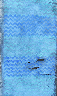
The Spanish word for peace is "paz". The quote you will see in the final is from Psalm 29:11. There is nothing quite like soothing blue colors to capture the spirit of "peace".

The previous couple of postings with a tighter weave (muslim) did not yield great results. That piece of fiber is now in the garbage and I returned to my lightweight linen type fiber with a looser weave. And for those who say..."You could have saved it; why did you throw it in the trash?"....that is not always true.

To create these very textural kinds of looks by deconstructing fiber, it is very important to have a fiber that is deconstructable. Otherwise, you can "beat a dead horse", but it will not be revived. It's dead!

So I began this piece with black gesso on one side and allowed it to dry thoroughly over the weekend. This morning I sanded it, and the deconstruction yielded some nice frayed areas and a few holes. And that is excellent, because I plan to adhere silver leaf to the area of the support where this will be placed and that silver will come shining through.

The next step was to spray the fiber with Palette Wetting Spray (Liquitex). The spray is different than simply spraying water because it consists of a polymer emulsion that is designed to keep the acrylic paint wet for a longer period of time, but it also helps blending and moving the paint around. (I have found that "chip brushes" are the very best brush for applying fluid acrylics to fiber.)

The mixture used for this base color was Cobalt Blue, a bit of Raw Umber, and a lot of White. (Fluid Acrylics) This dilute color causes a color vibration with the more intense colors stamped over this background. Cobalt Blue (straight from the bottle) and Cobalt Turquoise + White are the colors of the chevron pattern. (Color was brushed onto the stamped with a chip brush.)

And just in case you haven't noticed, chevron patterns are the rage right now. So let me take this opportunity to give a "shout out" for my daughter Alice, who is creating some fabulous wrist bags and tote bags, and also makes custom t-shirt quilts.

Check out her products at http://www.etsy.com/shop/ChevronBagsUnlimited. And there you have it...just a few more things to think about.

Friday, November 8, 2013

"Fiber Preparation" (draft 2)

(image 1)

(image 2)


Deconstructing fiber is a process of painting and then sanding. Even though this is simply a "process piece" for my journal, the word deconstruction is very descriptive of some of life's processes. It generally involves deconstruction followed by building on the newly deconstructed surface. The artist has the image of the finished piece. God has the image of our finished life as the deconstruction takes place.

If you think a sander is just for deconstructing fiber...think again. It is possible to do the same thing with quality water receptive papers. I have actually sanded paper until the edge was razor thin. It is a beautiful look and I do have plans to teach that this coming year. There are many possibilities.

So yes, you can go ahead and ask Santa for an electric and variable speed palm sander for Christmas. And should you have any reluctance at all about how aggressive to be with your new tool, just come to my studio and I can show you how to have some real fun!

As you can see, there are two images today so that you can see the applied paint before the sanding. I did paint the entire piece with Titan Buff Fluid Acrylic; allowed it to dry; followed by sanding before applying the colors you see. Notice that the chevron pattern always comes back to some degree during the sanding process. So whatever texture is imprinted into that Super Heavy Gesso during the first layer remains throughout the process.

The last thing I did was practice laying in lettering with enamel paint and a mop brush. What I wanted to notice was the comparison between how this type of fiber receives this paint as opposed to the looser weave of the other fiber I've been using. This one definitely receives it better because of the tight weave and that's without preparing the surface with Gel Matte Medium. Although, I did paint the back side with black gesso in the beginning.

And these kind of details are important to notate when placing the "process piece" in your journal. Why start at square one every time you do something? I guarantee you will not remember what you did six months from now. So it makes sense to have this notated for easy reference.

So now I will be ready to select my colors for the 16" x 20" or they may remain the same as what you see today. It does help to see how they work together in this piece. One thing that will make a difference is allowing the red/purple or blue/green dominate the piece by taking up more space. And there you have it...just a few more things to think about.

Thursday, November 7, 2013

"Fiber Preparation" (draft 1)


Today's posting is a "process piece" in preparation for a 16" x 20" canvas. I know from my own experience that it is instructive to see some of the very first steps in a process. It doesn't look like much today, but by tomorrow it will have full blown color. Never despise small beginnings...just keep going. 

My desire at this point is to move away from too much uniformity with horizontal bands. So in this piece I am shaking it up a bit by having random patterning and color. This is also a tight weave and lightweight muslim. I brushed black gesso on one side followed by drying it with a hair dryer and then sanding. To give it more stability, I repeated the process on the back side.

And then I began to ask the "What if..." question which led me to swiping some Super Heavy Gesso on a portion of the fiber. If you look closely, you will see a chevron pattern stamped into the gesso. The gesso is receiving the stamping in different ways depending on the thickness of the gesso. By tomorrow morning all of this will be "bone dry" and ready to paint. There will be a marked contrast in the way the fiber without the gesso and the fiber with the gesso receives the paint. 

In the meantime, I am continuing work on two other large works. It takes many days for layers of paint to dry and prepare the fiber. And that is the beauty of working on more than one piece at once. While one thing is drying, you simply go to one of the other pieces. 

My large journal will now have another addition (with notes) after I finish the piece of fiber you see today. And then I will switch to the actual piece, select the text, allow for drying time, and post the process as it goes along. And there you have it...just a few more things to think about.

Wednesday, November 6, 2013

"Fuego de Colores"


($125.00.......8" x 10".....Water Soluble OIls on 2" Depth Cradled Gessobord)

Today you are looking at "Fire of Color" (translated from the Spanish title). It is a palette knife oil painting using lots of paint. It's designed to represent my South Texas roots and inspire you with bright color.

All of my abstract palette knife paintings have gestural writing included, but actual, readable text is no longer a consideration for these types of works. I am reserving my lettering to canvases, watercolor or other mixed media works.

Design considerations are still a factor here. The orange is taking up just a bit more space than the blue, but the orange being such an intense color is definitely taking center stage. And even though all of these colors appear very intense, they are all diluted to some degree. Color is diluted by adding black, white, gray, or some of the complementary color. The darkest color is actually a very dark green created by mixing Phtalo Blue (Red Shade), Ult. Blue, Alizarin Crimson, Cad. Yellow Light. Yellow appears in all of the colors represented and this limited palette is why they all work together.

There is also a vast range of edges and line work going from totally blended to slightly blended and to a sharp edge. The writing also creates movement and energy along with some of the color shapes at slight diagonals.

The title was inspired by the flame looking shapes coming out of the orange. Integration was helped by allowing some of the base color (dark green) to be peeking through the entire piece. And there you have it...just a few more things to think about.

Please contact me personally to inquire about this piece.

Tuesday, November 5, 2013

"South Of The Border"


($60.00......6" x 6".....Water Soluble Oils on a 2" Depth Gessobord)

No quote today, but the title surely fits the colors in this piece. It is an abstract created with oils and palette knife. You can see hints of lettering that were also deconstructed by swiping out portions of the letters.

Most of the colors that were laid down first were the very intense ones. What brought it all together was going over portions of those colors with a swipe of black (mixed, not out of a tube). Depending on the pressure exerted with the palette knife determines the "skipping" over some of the first layer to create very interesting shapes.

This might be a good time to talk about canvas vs. gessobords. I do not use canvases at all for palette knife. My preferred surface is something very smooth. The palette knife seems to work better on all of the Ampersand Gessobord Panels and Cradled Boards. I also like working on Hot Press Watercolor Paper for the same reasons. Paper is nice since you don't need to commit to mounting or framing it. Gessobords are more expensive than paper. The difference is that the paper tends to absorb a lot of the paint. I haven't tried to use gesso first on the paper, but that might be a great option.

Besides experimenting with new materials and techniques, the skill that needs to be honed to perfection is the art of noticing what is happening while you work. Ask lots of questions, pray, take a walk, call a friend, and then go back in with fresh eyes. It's all part of the process. And there you have it...just a few more things to think about.

Please contact me personally to inquire about this piece.

Monday, November 4, 2013

"Work It Out" (3) (Process Piece)


It is quite amazing how much preliminary work has to happen in order to create a large piece. Today's piece is my color selection for a 30" x 40" which will eventually have this type of fiber treatment included. Text will be from the Bible, but I haven't made the final decision.

Today's process piece tells me several things. Do I want to paint the back of it with black gesso and take a chance of too much of that black color seeping through the fiber? Probably not, so I will need to be selective in where the black gesso is placed or do it before the exposed portion is completed.

Another important thing I was wanting to test was lettering done with fluid acrylic and an #6 Automatic Pen. It holds a lot of pigment and the writing is done on the corner much like a ruling pen. I did find out that the fiber has to be sealed on the back and prepared for lettering on the front.

The other techniques on this piece were created by writing into the dull brown color with a mop brush dipped into the yellow green color. I then cook a commercial stamp and dipped one end of it into the paint and stamped onto the background. These are textures that are now recorded and will go into my large journal as a reference.

My hope is that I've convinced others who like to do experimental work the efficiency of making notes. Another favorite way of notating "work off" pieces is to cut up some watercolor paper into a small size (i.e. 4" x 4")...glue the sample on the paper....punch a hole in the corner and place on a binder ring. It takes up very little space and provides a ready reference for all of your future pieces. And there you have it...just a few more things to think about.

Sunday, November 3, 2013

"Work It Out (2)" (Process Piece)


Today's posting is another "process piece" that will continue to inform my decisions about larger works on canvas. Experimenting, making notes, and keeping "process" journals is part of the journey in creating a piece of art.

Yesterday afternoon, I tore off a good size section of fiber and covered it with black gesso. (I laid it on wax paper to keep it from sticking to a surface.)  It took a while to dry, but by evening I applied some Fluid Acrylic in a dull brown color with a "chip brush". (They are the best kind for applying paint to this type of surface.)

While the paint was still wet, I dipped a large "mop brush" into a raw sienna mixture of Fluid Acrylic and lettered directly into the wet paint. Brush lettering '"wet into wet creates a more subtle edge. I then dropped down to the bottom area and wrote with the same brush on dry and primed fiber.

You can also see an area in the middle of a stripe painted with the same brush. While the paint was still wet, I stamped into it with a commercial stamp for a bit more texture. You can see the difference in the stamping by how much paint was on the fiber in different areas.

The last thing I did was write with Bleedproof White Gouache with a pointed brush (WN Sceptre Series) followed by a few words with a pointed pen. It will obviously need to go much larger, but I am leaning towards the pen which gives a crisper finish.

I now have two fabric swatches to add to my large journal book. This will become a ready reference for techniques on fiber. It is wise to make notes on your swatches or cut them down and glue them into a journal and make notes on the journal page. "Process is the breath of creativity." And there you have it...just a few more things to think about.

Saturday, November 2, 2013

"Work It Out" (Process Piece)


The text for a large piece I'm working on is from Proverbs. The particular verses have not been decided yet, but today's posting is a "work off" piece created on the same fiber as in the larger work. You're just getting a glimpse at how I work things out. It's similar to rehearsing for a performance.

My goal in creating several "work off" pieces is to see how different instruments of writing and mediums respond to the surface on a 24" x 30" canvas that is ready for lettering. There were several others, but the one you see today is the one that informs me as to how the surface must be prepared to receive gouache and a new medium I'm experimenting with....enamel paint.  (Rust-Oleum from Home Depot)

So the first bit of information that I gleaned from this morning's work is that the back of the fiber must be painted with black gesso. The fiber side where the lettering goes must be prepared with at least (2) coats of (2 parts water to 1 part gel matte medium). If these steps are not taken the gouache bleeds a bit and the enamel paint bleeds a lot. The enamel paint (in black) that you see today was written by dipping a mop brush into the paint and writing by allowing it to drip. It is the perfect medium for this surface to create some expressive lettering.

I also used a ruling pen (the white larger lettering in Spanish) with limited success. On the next "work off" piece, I will be doing some brush lettering loaded with gouache. I also know from yesterday's posting that the Speedball C series works very well on this surface.

And this is the way pieces are put together...especially when they're experimental. The studio then becomes a laboratory to see what works and what doesn't. And there you have it...just a few more things to think about.

Friday, November 1, 2013

"Bienvenidos" (final)


($125.00....6" x 12".....Mixed Media on a 2" Depth Cradled Gessobord)

"Cowhide is the welcome mat of Texas." And all of the native Texans out there said...."Amen!"

I hope this process has shown the contrasts that are available by using very shiny acrylic and very textured fiber pieces. If you would like to experiment with fiber, I would suggest a lightweight muslim or something with a slight open weave in neutral/solid color. I have tried heavier fabrics and they are not as easy to manipulate and sand as the lighter weight. I personally gravitate towards a thin muslin fiber. Once the paint gets applied, it becomes stiff, but is very easy to deconstruct using a palm sander.

Another thought about Fluid Acrylics. It is expensive, but it is highly pigmented and brushes on in a thin, but even coat. And even though it takes (3-4) coats, it is quite smooth. This smoother look is very difficult to achieve by thinning down Heavy Body Acrylics. So the combination I have found to be really cool is to texturize Super Heavy Gesso by spreading it on with a palette knife and then laying different textures into it or scribbling into it with a bamboo pen. The Fluid Acrylic adheres to the gesso quite nicely, creating a very glossy and textured surface that is created in the gesso.

Experimentation is very important, even if it does not yield a successful piece. What it does yield is information on mark making, materials, process, and how to develop a strategy for a larger work. So the piece you see today has helped me work out the "kinks" for something that will be a 30" x 40" size. Doing it small first saves me a lot of time. And there you have it...just a few more things to think about.

Please contact me personally to inquire about this piece.

Thursday, October 31, 2013

"Bienvenidos (draft 2)


Things have calmed down since yesterday with a few less stripes and dominant color. A line of "scripty" lettering will take the eye right to the fiber. I am also planning to change the title to "Bienvenidos". The quote will be on the piece by tomorrow.

As you can see, I added another piece of fiber and painted out a few stripes with black gesso followed by black fluid acrylic. It is important to paint over the black gesso with acrylic to have the high gloss contrasting with the fiber.

The existing stripes were taped off with painter's tape and painted with two coats of fluid acrylic. When that dried thoroughly, I hand sanded (with very rough sand paper) those stripes to reveal some of the texture from the first layer that was inscribed into the Super Heavy Gesso. This particular gesso is a Liquitex product. It is expensive, but I found some at Hobby Lobby. I like the feel, the texture, and the way it receives the paint. It is also very sandable without the "rubbery" texture of some texture mediums.

The fiber has yet to be adhered until I finish the lettering. I will be preparing the surface the same way I do for paper by brushing on (2 parts water) to (1 part gel matte medium). And there you have it...just a few more things to think about.

Wednesday, October 30, 2013

"Bienvenidos" (draft 1)


Today's posting is in a very rough state, but I thought it would be good to show it anyway and see how I resolve some of the chaos. I also plan to have a one line Texas quote harkening back to my roots.

I began with Super Heavy Gesso which I applied last night so it would be dry by morning. It was texturized by placing a strip of a mesh grid into the gesso and then lifting it out. After that, I wrote into the gesso with a bamboo pen really fast and not caring whether it was readable. It is simply there for texture. (It is important to apply the gesso with a palette knife as thin as possible to do this type of texturing.)

The small stripes might be gone by tomorrow or at least two rows at top and bottom close to the fiber. I would like to keep a few rows because of the texture created by the writing. And if you like that effect, it is important to paint the dried gesso with black gesso. After it dries, use fluid acrylic, but with very little paint on the brush and held at a low angle so that the paint skims over the sgraffito type lettering.

There will also be a bit more sanding after the paint dries on the fiber piece. This is an important piece because I am using this technique on my 30" x 40" canvas. I already know that I will need to have a hugh contrast of size between the bands of color based on what I've done so far. And there you have it...just a few more things to think about.

Tuesday, October 29, 2013

"Underbrush"


($60.00.....6" x 6"......Mixed Media on a 2" Depth Cradled Board)

This piece may or may not have a quote. It is acrylic paint so I could take that option tomorrow.....but probably not. Sometimes words are not needed. After taking a walk this morning and noticing a lot of underbrush around the fence line, I decided to come back to the studio and do a small abstract. Unbeknown to my conscious mind, the piece which was created very intuitively, ended up looking like the tangled "stuff" that was very impassable....just a different color. The solid yellow green that has no texture is a direct contrast to the underbrush. In case you want to go deeper in your thinking, this piece also represents the way our thoughts get tangled until we walk into a clearing where there is nothing to obstruct our path. Just chalk this soliloquy up to the meanderings of my mind today.

I began this piece by brushing on some gel matte medium over a 6" x 6" cradled gessobord, followed by the laying down of silver leaf. After I brayered over the leaf and dried it with a hair dryer, I mixed up my paint. Because it is acrylic I liberally added some retarder to the paint with a palette knife to have an open window of time before the paint dried.

After doing my first pass with all three colors of paint, I decided to start over, so swiped through the entire arrangement, knowing I wanted the yellow green to touch four sides of the design space to create a cruciform format. So I laid down the dark green first, follow by the yellow green and white. (only one pass of the knife with that untextured color.)    I then started laying in some line work with a bamboo pen to reveal the silver...swiping it out a few times before I was satisfied.

What is interesting is that I changed the orientation of the piece which revealed what looked like an open wire fence and the brush behind. It proves that we often end up with a piece that directly reflects what we are grappling with internally. And there you have it...just a few more things to think about.

Please contact me personally to inquire about this piece.

Monday, October 28, 2013

"Su Camino" (final)


($180.00......12" x 12"....Mixed Media on Stretched Canvas)

"Wait for the Lord and keep his way." (Psalm 37: 34 NIV) The Spanish Gothic and Spencerian Script combination remind me of lettering on signage and labels in Mexico. This is also one of my favorite chapters from the Psalms.

The only thing left to do now is spray the fiber piece with acrylic coating (3x) followed by (3) coats of spray varnish and then (2) coats of brush on varnish. All of this requires drying time, but I have plenty to do since I just created the same background texture on a 30" x 40" canvas. However, it will be a different color.

One of the looks I particularly like is the high gloss of acrylic paint that has also been textured like the background of this piece. It has the look of rusty metal. So sandpaper and sanders are definitely a part of my studio equipment.

If you like this background, all you need for experimentation is a canvas or clayboard.... heavy gesso or molding paste that has been texturized...some black gesso....fluid acrylic...and sandpaper. Finish it off with acrylic coating and varnish and you will have a metal look.

The only other thing that might be noteworthy is the fact that there are actual holes in the fiber as well as some of the background color which create total integration between the background and fiber. And there you have it...just a few more things to think about.

Please contact me personally to inquire about this piece.

Sunday, October 27, 2013

"Su Camino" (draft 1)


"Espera en Jehova, y guarda su camino." This verse from Psalm 37: 34 is translated...."Wait for the Lord and keep his way." It is a short verse packed with two specific commands that give guidance in all kinds of circumstances.

This piece is a continuation of a new path I am taking with acrylics and fiber on canvas. If you look closely, you can see texture and writing in the background.

The background was created with Super Heavy Gesso (Liquitex) on a 12" x 12" stretch canvas. I used a strip of grid like mesh used in taping and bedding a wall by laying it in rows on top of the wet gesso and picking it up with a palette knife. This was repeated until the whole piece had this texture. I then used a bamboo pen to write my text in Spanish at the top and bottom.

After all was completely dry (overnight), I primed it with black gesso...allowed that to dry....and then mixed up the yellow orange color from Fluid Acrylics. This mixture was applied with a sponge brush in two applications...drying in between.

After the last coat of paint was thoroughly dry, I lightly sanded it to reveal some of the black and white gesso underneath and cause the texture to be more visible. While all of that was going on, I was also painting black gesso on my fiber followed by sanding, painting, sanding, painting, etc. until the texture you see today was achieved.

It has not been adhered to the support because I like to write on a flat, hard surface rather than fighting with a canvas. Of course, lettering will make all the difference in the world and I will be posting that tomorrow. And there you have it...just a few more things to think about.

Friday, October 25, 2013

"Bird of Paradise"


($60.00......6" x 6".....Water Soluble Oils on a 2" Depth Cradled Board)

Leftover paint is put to good use by creating small abstracts. It offers more practice with how to lay down paint with gestural marks, doing some writing with a bamboo pen, and then deconstructing part of the lettering by swiping through it.

So as you might guess, this piece was created with leftover paint from "Autumn Red". It has the colors of a "Bird of Paradise" without the bird. Meanwhile, back at the ranch, I am beginning work on a 30" x 40" canvas.....a 12" x 12" canvas....and finishing up a 24" x 30" canvas. I will be showing the process on the 12 x 12 beginning tomorrow, and cropped areas of the larger ones will come in November.

Those of you who are lettering artists know that the process always slows down when you get to the lettering. And that's the case with the 24 x 30. To make the best use of my time, I have decided to begin the other two pieces so that the heavy gesso and fluid acrylic paint can be drying while I letter. Trying to dry these types of applications with a hair dryer is like watching water boil. It drives me crazy!

Some of the other recent decisions I've made are to eliminate quotes on all of the abstracts created with a palette knife. But I'm stepping up the lettering quite a bit on all of the canvas pieces. There will be 2" versals, gestural writing, and script on all of these with some of the lettering readable from across the room. It's all very exciting and I will share bits and pieces of those works as I go along.

Another good bit of process information is to have smaller canvases and gessobords on hand for prototypes for the larger ones. Working on a range of sizes stretches the creative process and gives yourself more versatility as an artist. And there you have it...just a few more things to think about.

Please contact me personally to inquire about this piece.

Thursday, October 24, 2013

"Autumn Red" (final)


($400.00....12" x 18"....Water Soluble Oils on a Flat Gessobord...Presented in a Custom Frame from Balcones Frame)

The end of a painting is always a bag of mixed feelings...especially when there is an inspiration photo to compare side by side with the painting. Because of the abstract and painterly effect of palette knife painting, it is best to withhold judgement and simply place it on a easel in the studio and leave it there for a few days.

The emotional appeal of these types of paintings has nothing to do with exact representation, but has more to do with the amount of paint and the "gestural" quality of the strokes. At the end, I did leave my image on the full screen of the computer and made a side by side comparison. There is no question that the painting was inspired by the reference photo, but there are also some obvious differences.

So I guess my advice is to make sure the color notes and shapes are reasonably correct and then enjoy the movement and direction of the palette knife strokes. The absolute beauty of this type of painting is the way the light hits the painting which is due to the extreme texture and movement of the strokes.

Because I am using so much paint, I use coupons "ad nauseam" and every time I am near a Hobby Lobby or a Michaels...I buy paint. Winsor Newton Water Soluble Oils are still my favorite because they are a thicker viscosity than other brands of regular oils. It is also quite nice not to deal with Gamsol or any other type of mineral spirits.

So I now feel as though I am getting my "sea legs"....so to speak and encourage anyone to at least give it a try. It's very addicting and you might just find a new way to communicate visually. And there you have it...just a few more things to think about.

Please contact me personally to inquire about this piece.

Wednesday, October 23, 2013

"Autumn Red" (draft 2)


This might be laborious for some of you, but I do have a few palette knife compadres out there and we are all curious about how each other creates our work. There is still a lot to do, but it has dramatically changed since yesterday.

The biggest problem in showing a painting in progress like this.....is the outcome. If I don't like it, it will be another "wash" and I will start over again. I do want to keep these experimental pieces rather than scraping them off because it informs all of my future work. But so far, I am not throwing in the towel yet. And those who know me well....know that I am one determined "little 'cus"!

The only thing to say about today's work is that I am continuing to mix color and lay down paint. The touch does become very important since too much pressure on the knife will disturb what's underneath. So "one swipe" in one area is it!

Seeing it on a computer screen tells me I need some more very dark areas, so that will come tomorrow. Now I am out the door to do some photography and enjoy the beautiful weather. And there you have it...just a few more things to think about.

Tuesday, October 22, 2013

"Autumn Red" (draft 1)


Today's posting is the first draft of an oil. (12" x 18") It shows the stroke direction and values created with the palette knife. This is representative of app. (2hrs) worth of work. Most of the time was spent mixing paint. It will eventually look like autumn in the Texas Hill Country.

Selecting an image to spend a lot of time with is very important. If there is a lukewarm response to the inspiration photo, the process will become very laborious....very fast. So the first thing I endeavor to do when out with my camera is to find shots that show a great deal of contrast and contain colors and texture that resonate deep within me.

And the fall is a very good time to go out with a camera and look for those shots that will inspire you back in the studio. The particular photo I am referencing for this piece was taken last fall on Cow Creek Trail. (Only in Texas do we have such fabulous names for back country roads!) I have almost exhausted my supply of photos, so I am ready to go out and do it again.

Since I am already familiar with the palette knife, I am now trying to be more creative with the palette knife strokes by using different sizes and changing directions slightly with each stroke. Because the paint is thick, it will reflect the light better with this approach.

This type of painting is not for the impatient person. It does take practice and confidence to lay down those strokes of paint in such a way that it communicates a semblance of the landscape.  Deciding on what values get laid down first is the hardest part.  It's almost like a chess game....calculating the next move.

I must love it because I keep doing it! And there you have it...just a few more things to think about.

Sunday, October 20, 2013

"Corazon" (final)


($60.00......6" x 6".....Mixed Media on 2" Depth Cradled Board)

"Above all else, guard your heart, for it is the wellspring of life." (Proverbs 4: 23...NIV) One of the key words in this piece is "wellspring". A wellspring is a source or supply of anything, especially when considered inexhaustible. So whatever is flowing in our hearts (the seat of our thinking and emotions) is very important and charts the course of our lives.

So as far as the look and mood of the piece, I feel satisfied that I accomplished what I set out to do. My desire was to have an extreme contrast between textures which also results in a contrast of new vs. old. By using Fluid Acrylics (3 layers over black gesso), I was able to achieve a high gloss and very smooth color application to the background. It comes across as very contemporary and gives me the vehicle for going into my colorist voice.

The deconstruction of the fiber by painting, sanding, painting, sanding, etc. until it is aged to perfection (to the point of making holes in the fiber) goes to the heart of my artistic voice. That's why antique stores hold such a hugh appeal and this is an aging technique that is worth its weight in gold. You can see the red background peeking through the holes and stray threads veering off from the edges.

To set up a sanding station, I laid the fiber on a large section of MDF board. The fiber is much easier to sand after some paint has been applied to make it stiff. You then must hold the fiber with your left hand by spreading out your hand and sanding in the "taunt" area and this is especially true when going close to the edge. It also helps to have a variable speed palm sander and use medium to course grit sand paper. It takes a lot of grit to deconstruct fibers.

After all of the sanding was done, I turned the piece over and painted with black fluid acrylic and that's why you see the holes and threadbare areas a dark black. It also seeped to the edges in some places.

All in all, it is a very creative alliance with high gloss and dull, threadbare, and aged fiber. This piece is on a cradled board, but the large works are on canvas which gives a range of other options such as stitching the fiber on with several strands of embroidery thread followed by gesso and paint. And there you have it...just a few more things to think about.

Please contact me personally to inquire about this piece.

Saturday, October 19, 2013

"South Texas Vibe" (first draft)


I haven't written the quote yet, but it will probably be spiritual in nature and I am thinking 1st century versals in black on the fiber piece. This posting is a small microcosm of what is happening in my studio on a much larger scale on canvas.

The inspiration comes straight from South Texas and the Hispanic culture. Call me a "valley girl".....or at least from the Rio Grande Valley in the southern tip of Texas. The tropical climate, along with the Hispanic culture is feeding right into my art journey. It doesn't take long after living there, to realize that the Hispanics do love bright color and also striped sarapes, rugs, and bright and colorful pottery.

My direction for the large scale works is to show the extreme contrast between the aged fiber art, peeling paint on pots, walls, and fragments from tiles......and the bright and shiny colors that are interspersed among all of this. It is completely natural for me to go in this direction and now I am embracing it with all my heart.

The techniques involved in aging something, whether it's fiber or paper is effectively done with a sander. (variable speed is useful) So you can see that there is a huge contrast between texture, color intensity, and erratic edges vs. smooth edges. And the larger the piece, the more these contrasts create a dramatic effect.

So I'm having great fun in this return to my past and the nostalgia of all that is in South Texas. And there you have it...just a few more things to think about.

Friday, October 18, 2013

"Running Through" (final)


(unavailable.....12" x 18".....Water Soluble Oils on a 2" depth Cradled Gessobord)

First attempts at something are always difficult before they are easy. I did take a few liberties with this piece so that the stream flowing through the rock will be more convincing. For that reason I am not posting the photo, but eventually I will in a future piece.

The hugh "take away" from this piece are all of the lessons learned by simply laying the paint down. And that's what it takes to master something. It is a matter of learning something with each piece and making the observed corrections in the next one.

It has been my personal experience that it is better to move forward and finish the piece rather than scraping off the paint repeatedly. It is good to then use the piece as a reference and appreciate the progress made in the next one. Many of these type of pieces will need to be painted before I feel truly comfortable exhibiting it, but I will switch to flat panels to cut down the cost and then when something turns out really well, I can present it in a frame.

It is a misconception that everything created needs to be exhibited. I have fallen into that trap and am now determined to chalk those pieces off as learning experiences and keep practicing. The reasons for considering every piece as an exhibit submission are very real and often hard to overcome. Materials are expensive and there is always a tendency to want to redo endlessly until the life is literally sucked out of the piece.

However, some of the top oil painters in the country will say that an artist needs to do at least (100) smaller works just to get the hang of things. And even though I've created much more than a (100), there is still a learning curve going from small to large.

So why am I "rambling" on about this today? Because it helps me sort out my own process and hopefully helps other artists to realize that not all pieces need to be hung or sold. Those discarded pieces are memorials of "new beginnings". And there you have it...just a few more things to think about.

Thursday, October 17, 2013

"Running Through" (draft 1)


(12" x 18"......Water Soluble Oils on a 2" depth Cradled Gessobord....first draft)

This is the first draft of a 12" x 18" oil painting of a scene at Bull Creek here in Austin. It's good to see it at this stage for those of you who are on a "palette knife journey" because it is easy to give up at this stage and assume that all is lost. The good news is that you simply need to keep laying in the colors until you're finished. It's a "faith" lesson.

My thought process in all of these abstract landscapes is to think backwards. In other words, I laid down a very dark brown/gray color over the entire piece first. That enables me to scrape back to that dark color when forming boulders and rocks.

The next step is to decide what shapes and colors should go down next. For me that means to study the photo (or real time image outside) and think about it in layers. In other words, the trees cannot be laid in before the ground and everything behind the trees. So by thinking backwards, it's fairly easy to know the next step.

And of course, there is a lot of color mixing going on and the larger the painting, the more space is needed to mix those colors. I now have an 18" x 24" palette which works beautifully.

If all goes well, I will post the inspiration photo with the final piece. And there you have it...just a few more things to think about.

Wednesday, October 16, 2013

"Palm Branch"


($60.00.....6" x 6".......Water Soluble Oils on 2" depth Cradled Board)

There is no quote on this piece, but the word palm is written and then deconstructed by covering up part of the word. The lettering in these type of pieces is intended to create movement and a variation of line. This is an abstract of a palm branch describing its movement and color.

I was careful to use at least three values of green and three values of the tan to give the piece some depth. So this is something that still must be considered even in an abstract piece. The piece was created very much like yesterday's posting by mixing the colors and placing them on the support in varying amounts.

The greens are taking up a greater percentage of space. The dominance of one color in a abstract will calm the somewhat chaotic nature of abstraction. Dominance of any of the design elements always brings more harmony to a piece of artwork. This is very important to remember so that you know exactly what to do in order to calm a piece down when there are too many competing elements. This is an important design principle in all mediums.

It is also important to keep the shapes in mind. I intentionally added more yellow green going from the center down to the right hand corner and connecting with the other yellow green that goes off at the top. And anytime a shape can touch three sides of the design space is a good thing.

Rhythm was created by using the same directional strokes and bringing in a slight diagonal vertically and horizontally. The gestural lettering creates some more rounded lines. And by virtue of the tool itself (palette knife), some edges are sharp and some are blended into the neighboring color.

So abstraction in general is all about design. And there you have it...just a few more things to think about.

Please contact me personally to inquire about this piece.

Tuesday, October 15, 2013

"Surf"


($60.00......6" x 6"....Water Soluble Oils on a 2" Depth Cradled Gesso Board)

Today began with a warm up with palette knife and oil paint. Hopefully, I will have the larger one over the finish line very soon. The inspiration for this image came from a color magazine of interior rooms. No quote.

For those who like to have fun with your palette knife, this approach is a good warm up and an excellent way to practice mixing colors from a limited palette. Of course, the palette is set up with a warm and cool of each primary plus white. That makes (7) colors on the palette. At least one of each of the three primaries plus white created the tan color. The mint green was created with Pthalo Blue (just a touch), lemon yellow, a touch of cad red light (to gray it down) and then lots of white.

Having a thorough knowledge of the color wheel and all of the direct complementary colors is essential to changing the intensity of any of the primary colors. Beginning with a small abstract such as this keeps it simple enough to focus on just (2 or 3) colors at a time rather than the full range of values typical in a still life, landscape, or figurative work.

So my double palette consists of lemon yellow, cad. yellow med, alizarin crimson, cad red med, ultramarine blue, pthalo blue, and titanium white. From this you can mix all of the other colors in all their tints and shades. I am writing about this again only because I know that some of you who follow my blog are still struggling with color. The reason I know that is because you've told me. And to quote another teacher who had a profound affect on me...."Always go back to the basics."

It's quite like a professional golfer who changed swing coaches to improve his game. The new coach started out the instruction with...."This is a golf club." And he had already won a lot of titles! So never feel bad about reviewing the basics to improve as an artist. It's the smart thing to do.

The technique I used on this small abstract was to cover the entire space with the tan color. The bottom layer was darker than what you see on top. I then swiped on a few strokes of the mint green, white, and a small bit of orange. The next step was to take a knife and make several gestural movements which mixed all of the colors a bit. I didn't like that so I kept going over it with my palette knife and then applied the mint green and white alternately with a single aggressive stroke. The word "aggressive" is important because the movement of that stroke is what gives the piece energy.  And there you have it...just a few more things to think about.

Please contact me personally to inquire about this piece.

Monday, October 14, 2013

"Gray Feather" (final)


($125.00......6" x 12".....Watercolor on Fabriano 300 lb. CP.....Mounted on a 2" Cradled Board)


"I wrote it down and my heart was healed." This quote succinctly describes what happened after our ten year old son was killed. Sometimes the only way to process something that painful is to write down the wound along with the scripture. It is often the only way that healing comes.

This piece is actually the same color range of an earlier one having to do with noticing, naming, and writing things down. I now have a desire to do a third one to make a collection. Working in a series is an excellent way to look at a similar topic or image and create it with a variation. It is much like a melodic line in music that is repeated with embellishment as in a Mozart Sonata.

For those who don't know my background, my degree is in Music Education and so the idea of comparing the two disciplines has always been fascinating to me. The parallels between music and art are stunning!

Since the first draft of this piece, the values have changed in the feather. The background mono print is darker than the first draft because of the photography. Today's image looks exactly like the original and the grays are the big attraction.

In the meantime...in between doing small works like this...I have begun some larger works. It is quite a challenge to do all of this simultaneously, but I'm always up for a big challenge. I have decided to do some palette knife oil paintings with no lettering just to focus my attention completely on the technique and colors of the Texas Hill Country.

So my encouragement today is to try working in a series and see what happens. The landscape will soon be changing dramatically and offer up some opportunities to really go neutral. And that really excites me! And there you have it...just a few more things to think about.

Please contact me personally to inquire about this piece.

Saturday, October 12, 2013

"Gray Feather" (draft 1)

(draft 1)


Unfortunately, I did not have time to finish this piece this morning. I do love all of the gray with a very complimentary gray feather. It was one of those treasures just lying on the ground.

The background of this piece was a perfect set up for my gray feather....and it was very easy to do. I began with a small piece of Fabriano 300 lb. CP paper. I then created two mono prints...one on top of the other.

A mono print of this type is best created on a glass surface. By mixing up some watercolor and water and sloshing it around on the glass with a brush, the dry paper is then pressed into the paint. When pulled off, you have a mono print that is totally spontaneous. If you like the dark spots in the piece, I left more saturated color in several areas on the glass. After this first print was partially dry, I mixed more color and did a second print. This created a couple of back runs and several hard edges. This was a perfect contrast to all the soft watercolor areas.

The palette was the key for these beautiful grays. It was two colors....Neutral Tint,  and Alizarin Crimson. (Daniel Smith Brand) It is so easy to overwork watercolor but this is a surefire method of keeping it fresh and luminous, since none of your brushes or hands ever touch the painted side of the print.

There is another very creative option of finishing off a watercolor like this. If you create the mono print on Arches Text Wove....you can then print over it with your printer and favorite photo. It creates really nice effects. (Arches Text Wove is light enough to run through your printer and available at Jerry's....Dick Blick....or Daniel Smith.) So this innovative process is the result of two different kinds of printmaking in one piece.

You will then, of course, need to mount it on a cradled board after spraying (3x) with spray acrylic coating or spray varnish. After mounting the piece, you will then be able to truly secure the surface by brushing on liquid varnish (Liquitex Gloss) (3x). And there you have it...just a few more things to think about.