Sunday, September 30, 2012

"Angelica"


($40.00....6" x 6"....300 lb. HP mounted on a 1/8" depth clayboard panel)

"An angel is a body guard sent by God." Angelica is Spanish for angel so it became the perfect title. Angels have specific assignments and I like to think that one of them is my body guard. It's a very comforting thought!

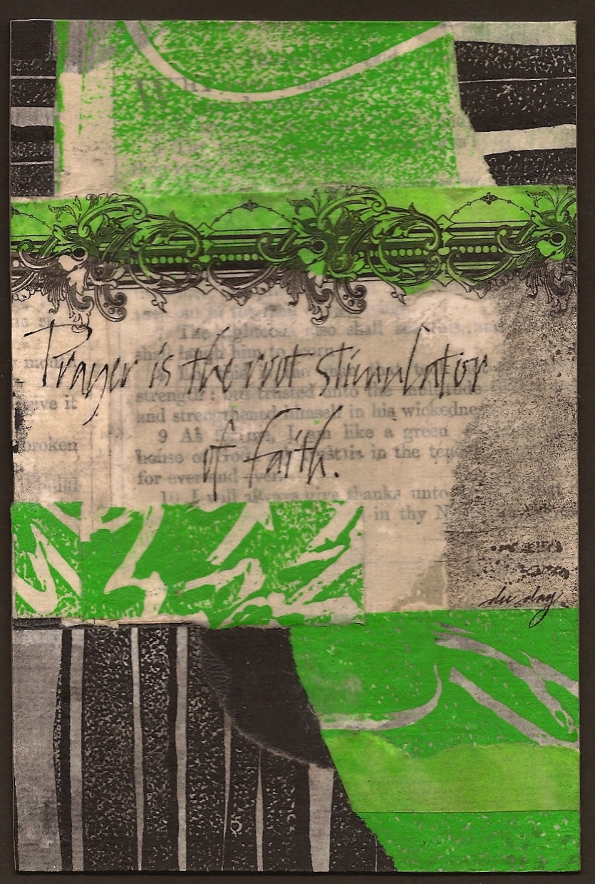
My experimentation is continuing by deleting the strong color and going totally neutral. There are also many more layers of papers just to create a tonal and textural variation. There are several techniques that I am consciously doing to give better integration and a sense of depth. When I overly a paper that is already there, I try to cut it a bit smaller and reveal the edge of the previous layer. It creates a lot of interest with edges and a sense of mystery by allowing some text to show or other texture.

To enhance the "back and forth" conversation between text overlaid with rice paper and other areas that have no text,  adhered just a fragment of the text into the static area. It then becomes more integrated with the piece. And if you look closely just above the quote there is a faint image of angels. It was a line drawing that I had printed on silk tissue paper, but after it was adhered, it was too much. When it was removed, it left a faint image which turned out to be far more subtle.

For those of you who are enamored with walnut ink, there are several pieces of rice paper that were stamped and colored a bit with a dilute portion of the ink. And of course, the three main dark areas are mono printed with black printing ink, gold orange (acryl gouache) with gestural marks in the paint. And there you have it...just a few more things to think about. Please contact me personally to inquire about this piece.

Saturday, September 29, 2012

"Settle In"


(unavailable)

"Fear flies away when thankfulness settles in." There is something about thankfulness that opens the door to many good things and gets rid of some bad things. The word "settle" is not a commonly used word, but it has a wonderful meaning. It means to become established in a place and thankfulness is a good place to get established.

This is the last in this particular color series. I began the week using blue/green and dark green plus white and black. Then there was the introduction of an orange complement followed by several other combinations. It is fun now to lay them all out and see how I feel about each one. Today's piece includes two sets of complements....orange and blue/green...red tint and dark green and yellow/green. I am still trying to discipline myself to identify colors by what is listed on the color wheel rather than using "trendy" names like magenta, chartreuse, hot pink, etc. My goal is to be intimately acquainted with the (12) colors on the color wheel in all of their intensities, shades, and tints.

Just to recap, my starting point in all of these collages has been black and white with the addition of color. From across the room, the division of space is strong and then there are many subtleties for close viewing. I have often read that judges of art shows look for strong division of space and good shapes which are quite identifiable from across the room. I am quite sure personal taste comes into play as well, but it is worth thinking about. Strong value contrast is essential for a piece to stand out from across the room, especially if it's a small piece. The challenge is to see if it can be done successfully.

The only danger I see in doing this type of collage work is entering into the world of visual overload. I've tried to overcome that by having many "echoes" in the piece. I will continue to play around with color percentages, but I will be interspersing some very neutral (like 80-90 per cent) in the next week or so. Doing small works is an excellent way to experiment with color, division of space, no detail or a lot of detail, etc. Give it try! And there you have it...just a few more things to think about.

Friday, September 28, 2012

"Poetry"


(unavailable)

"Poetry dresses thoughts with words of rich emotion." The reason poetry can reach the deeper levels of the soul is due to the poet's ability to bring the emotion of the thought by careful selection of the words. The background text pages from this week's postings have come from an antique book of Elizabeth Brownings's poetry.

In today's posting, I dropped down the percentage of space that the complementary colors of green, yellow/green, and a red/orange tint occupy. Each of the colors occupies approximately the same percentages with green being slightly dominant. There is also the contrast of the strong color areas to the light color shapes and the black. The light areas are the most dominant in the piece. 

Contrast of size and shape is also important. If everything is the same shape or just one shape, there will be too much harmony and the viewer will lose interest because nothing is standing out as being more important than something else. It is referred to as hierarchy in each of the elements of design. So one color, one line, one shape, one type of texture, one value, and one direction needs to dominate to create harmony. 

However, contrasts need to be present as well. That's why I included straight and ragged edges, very light and very dark areas (values will sneak up on you!), very intense and strong color contrasted with aged and old book pages, surface contrast between opacity, transparency, and translucency. Design is the visual vocabulary of art so it really is important to continue adding more knowledge in this area to your process. And that is precisely why I am experimenting with color percentages. Each small piece teaches me something else about design. And there you have it...just a few more things to think about.

Thursday, September 27, 2012

"Obligation"


(unavailable)

"Kindness is an eternal obligation." Normally, none of us would think of an obligation in a totally positive sense. But the dictionary does include a positive definition that means a kindness done or received.  That's the one I am talking about here.

Today's posting contains the same colors I've been using this week, but today I added a lot more of the  orange and pink, but left out the blue/green from yesterday. What I find most interesting is that the very dark green which is warmer because of the red used to gray down its intensity and the yellow/green which is cooler because of the white added create a good vibration between warm and cool. Another hot combination is the red with a lot of white to create the pink side by side with the yellow/green. Using these types of combinations draws the eye to that area like nothing else can. So it is very useful to look in decorating magazines and select combinations that pop off of the page for you.

By checking your color wheel, you will be able to locate the root color and adjust your mixing accordingly. Remember that the root color always originates from the (12) main colors on the color wheel with all of their tints, tones, and shades. I am personally trying to get away from calling colors turquoise or viridian...etc. If you begin to use the names listed on the color wheel, it will give you a more accurate description. And there you have it...just a few more things to think about.

Wednesday, September 26, 2012

"Exposed Thoughts"


(unavailable)

"Words are exposed thoughts." Thoughts remain in our head until they are written or spoken. More often than not, they probably need to stay in our head. Once they are exposed, they offer up a blessing or a curse. Which will it be?

My approach to my collages has taken on a different twist. Yesterday, I made a concerted attempt to lay down all my text pages on a primed sheet of 300 lb. HP (painted with black gesso) and deliberately allow more of the black background to show. In that way, the positive (text pages) and negative(black background) spaces were my primary consideration. Next came a the plain rice paper and some stained with umber and titan buff as overlays over the text. At this point I dried the piece thoroughly, did some gestural writing in pencil and then cropped the whole sheet, paying attention to the positive and negative only.

Color was added (the same colors from the last two postings) with the addition of the sliver of orange which is a split complement of green and a direct complement of the blue/green. You can clearly see what a difference just one small bit of the complement makes. Yesterday, the color blocks occupied about 50% of the design space. Today, they occupy about a third of the design space. Going back and forth with varying color percentages and which color will dominate is part of my experimenting this week. To create more subtle interest, I also adhered more text to the piece...both opaque and transparent. And if you like only neutrals, you can stop after adhering all of the text and leave the color off completely. Another idea is to use maps, line drawings, gestural marks, pencil and ink drawings, or painted imagery instead of old book pages. And there you have it...just a few more things to think about.

Tuesday, September 25, 2012

"Text"


(unavailable)

"Text provides knowledge and texture." Many artists, especially lettering artists, are totally enamored with text. We write it, design with it, collage it, read it, etc. Text provides us with two things that are appealing...knowledge and texture.

This entire week of posting is devoted to a series dealing with color percentages. Yesterday, there was very little color except for white and black. And in the type of collages I am creating, the black painted on the 300 lb HP provides the support with areas left visible and the white is created with text overlaid with rice paper and sometimes left visible. These two things keep the pieces anchored. The color is then provided by mono printed the rice papers with Speedball Printing Ink or...in some cases, acrylic paint. 

My color palette began with some dark green and a bit of turquoise yesterday. Today, I am expanding that palette and bringing in a yellow-green. The common denominator in these three colors is green. All three are occupying approximately 50% of the design space. The addition of the yellow green contrasted with the blue-green and the dark green adds a bit of drama. And with the exception of the red mixed in with the green to create this dark green, there is no obvious presence of a strong direct complement yet.

These are very good things to experiment with to give yourself practice in seeing how to tone down or "pump up the volume" in a piece. It's a very casual grid like format and very easy to do. Echoing the colors as well as the black, white, and transparent overlays is also important. You can also play around with arranging these bits and pieces by making a tray out of foam core and play with the pieces while watching television or riding in a car. If you're working small, you can place your pieces in snack baggies and have something very transportable. It's all about design. And there you have it...just a few more things to think about.

Monday, September 24, 2012

"Look and Listen"


(unavailable)

"Look and then listen with your heart." I love analogies that apply to art and life. This quote has meaning for both. So often we can get "frozen in fear" with the thought of making a decision. So look at the circumstance or look at the image and then listen with your heart.

After the last three days of color and then more color, I am now doing a series of experiments with color percentages. In today's posting, I deliberately decided to use very little intense color and went almost totally neutral. I also made things more interesting by mixing up a "sloshy" bit of Titan Buff Fluid Acrylic with lots of water on a glass surface and then dipped portions of the rice paper into this mixture. (Lay it on wax paper to keep from sticking while drying.) 

I love green and orange together, but instead of using a brighter orange for this piece, I opted to use accents of Gold Orange....a nice metallic acryl gouache made by Holbein. The old book spine inclusion was painted with the gold orange on the back side since it was falling apart and the paint simply seeped through the deteriorating spine cloth. Another interesting thing here is the addition of papers with no rice paper overlay adhered to the top of the other book pages hidden under the tinted rice paper.

Also, the addition of text printed on silk tissue paper and crossing over several color blocks (including the book spine) adds a tremendous amount of depth. So the center of interest was created in the darkest areas of the piece where the most layering has taken place and the contrast of opaque, translucent, and transparent layering is prevalent. And there you have it...just a few more things to think about.


Sunday, September 23, 2012

"Poderosos en Fortaleza"


($200.00.....12" x 12".....300 lb. HP mounted on a 1.50" depth clayboard)

"Praise the Lord, you His angels. You His mighty ones, who do His bidding, who obey His Word." (NIV) This is the last of three larger works created for an exhibit at Open Doors Gallery at Hill Country Bible Church. In another posting I referred to angels as the caretakers or caregivers of the world. That was inspiration for choosing this particular scripture.

Many artists have trouble with choosing a format, especially in a collage arrangement. The type of format I have chosen is a grid format. So when I am laying down papers, most of the first layers have straight edges. There are a few torn edges and overlapping shapes that create other shapes, but over all, you can see a grid formation, but it is not precisely measured or layed down in a precise manner. It was done very spontaneously.

My two main color selections were orange and blue, with blue having a slight edge over the orange in percentage of space it occupies.  If I had chosen to "tone" down the piece more, I could have allowed the blue or the orange to be obviously more dominant. By allowing them to occupy almost the same percentage of space, it becomes more dramatic. But of course, the black, gray, and white areas are dominant in this piece. 

In the next few weeks, I will be experimenting with strongly contrasting percentages to achieve all kinds of different looks. So when you look at an interior of a room with colors you love, pay very close attention to percentages and the amount of detail in a room. If you like clean contemporary rooms, you will want to cut a whole lot of the detail and have more translucent areas where text or imagery is barely visible and color areas have little or no detail. By choosing one kind of paper (such as rice paper) and mono printing them yourself, you can create more unity than you will get by grabbing just any old paper that's lying around. And there you have it...just a few more things to think about.

Please contact me personally to inquire about this piece.

Saturday, September 22, 2012

"La Palabra De Dios"


($400.00....18" x 24"....300lb HP  mounted on a 2.00" depth clayboard)

"The Word of God is living and active. Sharper than any double-edged sword, it penetrates even to dividing soul and spirit, joints and marrow; it judges the thoughts and attitudes of the heart."
(Hebrews 4: 12...NIV)

This is a larger work created for an exhibit for Open Doors Gallery at Hill Country Bible Church.  There is a conversation going on between the colors, textures, transparent prints on silk tissue paper, and plain rice paper over colors and text. I deliberately kept particular areas white or light enough to add some lettering. 

The cool thing about this technique is that if you don't have enough lighter areas at the end of the process, you can simply add some more plain rice paper. Metal leaf or metallic paint can also be added at the end to bring some illumination to the entire piece. In this case, I used one of my favorites...Gold Orange (Holbein Acryl Gouache) which has more of an orange look to it than most golds and creates a nice contrast with the purples. 

It's a very absorbing process and great fun to put together. Preparing all of the pieces takes as much time as adhering them to the board. And it also helps to have an extra table or two to lay everything out so you can see everything at once. And there you have it...just a few more things to think about.

Friday, September 21, 2012

"Bendice A Jehova"

($250.00......10" x 22".....mounted on a 1.50" depth clayboard)

"With all my heart I will praise His holy name." The scripture verse is from Psalm 103 in the New Living Translation. It was created for an exhibit at Hill Country Bible Church with a theme of "Visual Rhapsody". You are all invited to the Opening Reception tonight from 7:00 to 9:00. Check out the invitation at our website...pactofaustin.com

All of the many collages you have been seeing formed the basis of most of my larger works for this exhibit. In the piece today you can see how it looks in a larger more expanded version. You can have a chance at receiving one of those 4 x 6's tonight. We have well over a 100 of them (created by myself and some of the other participating artists.)  Be there early and you can be part of the drawing.

The striking part of this piece is the color selection. There are two sets of complementary colors...the turquoise and orange...as well as the magenta and green.By placing these two sets of complementary colors right next to each other and in several combinations, the color rhythm of the piece was established. I used expressive writing for the main quote. The expanded part of the same verse and a different translation were written in Spencerian script in both English and Spanish. And there you have it...just a few more things to think about. Please contact me personally to inquire about this piece.

Thursday, September 20, 2012

"Believe and Receive"


(unavailable)

"Believing is a prerequisite to receiving." Doubt, fear, and negativity will not get you where you want to go. Belief is an essential ingredient to receiving anything. 

The experiments with transparency, translucence, and opacity continue to be at the core of my work. In this piece, I have parts of the old bible pages adhered to the support with a one layer rice paper overlay. To add more dimension, I added another piece of rice paper over a portion of the other layers. And then if you want to include a word or line that would be totally readable, that piece is placed on top.

And then the transparent silk tissue paper with the line of black and bold lettering is placed on top of the previous layers with a faint image of the underlying bible page. It is the interplay of these elements that makes the piece so fascinating. Also notice the small arched window printed on silk tissue paper in the upper right hand corner. 

The experimentation with these transparent and translucent materials hold a myriad of possibilities. And even if you don't want to do lettering, line drawings of any kind will provide a similar look. You can find them in old books or create your own drawings and print them on rice paper if you like...saving the original for future projects. It's all quite fun and I hope your inspired to give it a try. And there you have it...just a few more things to think about.

Wednesday, September 19, 2012

"An Open Heart"


(unavailable)

"An open heart is ready to worship." The essence of worship is to put God first.


There are no more scraps from my large piece, so this is the last one of its kind. And only two more days of 4" x 6"'s and then I will be back to my 6 x 6 format. If you would like to receive one of these 4 x 6's...you will have a chance this Friday evening at the Opening Reception for "Visual Rhapsody". The pieces are all hung and this is an extraordinary exhibition.  (140 pieces)  Check out the invitation on our website at pactofaustin.com

After the many commentaries on "echoes", division of space, and designing corners, you can plainly see all of these things coming together in today's posting. If you like collage, design, and old books, or any other odd bits of paper, you can have great fun and a hugh learning experience in design by playing with a small piece of this type every day. If you need someone to hold your feet to the fire...call me. I'm quite good at doing that type of thing!

If you are also into other media such as mosaics, kiln formed glass, or assemblages, you will find that learning more about design through the medium of collage can help all of your work go to the next level. You can still be spontaneous and think about design at the same time. They are not mutually exclusive. In fact, the idea that things simply fall out of heaven on your head is a myth. Even people with tons of natural ability, must work hard to improve their skill level. So have fun, think, and work hard and you will soon be seeing much more depth in your work. And there you have it...just a few more things to think about.

Tuesday, September 18, 2012

"Private Chapel"


(unavailable)

"The heart is a private chapel." Joys and sorrows are deeply felt and worked out in the private chapel of the heart. That's where the conversations with God take place through prayer.

Black, red, white, and gold are a time honored combination going back to the time of monks. It was in the monasteries that they labored over their writing and illuminated capitals to preserve the scriptures. A very interesting fact is that paper had been invented in China long before it ever reached the shores of Europe. Consequently, vellum was the preferred writing surface and that's a good thing since paper would have deteriorated. We now can view hand written Bibles in many museums around the world because they were written on calf skin vellum.

This piece (like yesterday's posting) consists of the leftover cropped portions of a larger piece. This is a great exercise in design. Any scraps from any of your work can be cut up, rearranged into a totally different piece. You will discover divisions of space and odd combinations you would never have thought of on your own. So I would definitely place this technique in the spontaneous category. I will admit that I added the three bits of black and gold (in three different sizes) to give strength to the piece. And there you have it...just a few more things to think about.

Monday, September 17, 2012

"The Birthplace"


(unavailable)

"Solitude is the birthplace of great thought." This piece is a "sneak preview" and a cropped portion of an 18" x 24" piece in an upcoming exhibit. It seemed appropriate today since I'm feeling like a monk in a monastery! The Opening Reception is this coming Friday. Click on to our website for details. pactofaustin.com

Strange things can happen in a studio late at night. I was preparing to do a collage for today when I spotted the cropped off pieces of my larger piece. The imagery and division of space was compelling, so I made one piece out of two remnants from the large piece. It's quite "funky" looking, but also compelling, so without hesitation, I mounted them to a board.

When your internal critic is not screaming in your ear, things like this can happen. The truth of the matter is that I was too tired to listen to any critic, especially the one inside me. I hope this will give you a desire to just go with those odd "quirky" things that can happen when you least expect it. It doesn't always work, but you will know when it feels right. Trust those instincts. My new motto is.... "Go bold or go home!". And there you have it...just a few more things to think about.

Sunday, September 16, 2012

"Hallmark"


(unavailable)

"The hallmark of our lives is framed by our desires." A hallmark is a distinctive mark generally associated with excellence. The only way this can ever happen is to pay attention and act upon our desires. Desires tell us how we're wired and fuel the passion to do what we need to do.

Ever so often, I like to talk about process and what I have learned in 560 postings. The only way this can be done on a daily basis is to have a good schedule and have your studio well organized. To complete a small piece like this 4" x 6"...it takes approximately (3) hours. In the very beginning, it took about (4) hours so I am making process.  Whether or not people view my blog is not as important to me as having this daily warm up.  It keeps me thinking and acting on my design thoughts and lettering every single day.

The background is completed or almost completed the night before. I prefer to have an overnight drying time for most things and it is absolutely essential for pouring medium pieces. My quotes are not selected in advance. I respond to whatever imagery I've felt passionate enough to create. For instance, in this piece, I selected an ornate capital "H" without knowing that the quote today would be called "Hallmark". In the beginning, I came up with the quote first and the pieces took me a lot longer and didn't always come together as well as they do now.

My day begins at 5:00 or 5:30 and my posting is almost always done by 8:00. That gives me a bit of time for coffee, reading and thinking for about 30 min. before adding in other last minute details and writing the quote. If I leave town, I work ahead and have everything on my desk top before I leave. It is then just a matter of writing the commentary and posting each day.

Hope this helps you better understand what is involved with blogging. It is not for everyone, but working everyday on your artwork is the only way to grow. So whatever you decide to do, maintain a consistent schedule and keep everything in the same place. And there you have it...just a few more things to think about.

Saturday, September 15, 2012

"Motivation"


(unavailable)

"Motivation is energy fueled by ideas." It is amazing how one idea can trigger enormous energy and fuel  the possibilities behind a thought. The secret is to act on the idea before it flies away.

Creating a collage is like putting puzzle pieces together without having the completed picture to guide you. I resolve the problem by starting with a page or segment of text. I adhere it to my black gessoed surface with no thought to exact placement. Although it is good to place it somewhere where there is enough room to place papers around it.

In this piece, the second selection after the text and rice paper overlay was the largest purple section. The black and green at the top were laid down followed by the long vertical green piece. I then added a bit more text in the lower right corner followed by a torn piece of purple.

The last bits of collage printed on silk tissue paper were placed with the idea in mind to join two color blocks together. You might say they act like stitching. Placement was also determined by the lines already there. Again it is important to remember to include torn edges as well as straight edges. And if you include hand lettering, it is important to leave a section where the lettering can be written. It sounds complicated, but it really isn't if you remember the elements of design. Black, and white, plus one or two other colors in different sizes with different edges works every time it's tried. And there you have it...just a few more things to think about.

Friday, September 14, 2012

"Balancing Details"


(unavailable)

"Balancing details is an art." If there are too many details in life or in art, there is overload. However, if there are no details in life or in art, there is boredom and very little substance. It's a delicate balance.

As you can plainly see, I have been experimenting with design and collage. And details are very important when creating a collage. The most important thing to realize is that the eye is constantly looking for connections. And if the connections don't make sense, the viewer is unable to stay engaged in your art.

It is also possible to have a lot of detail, but not enough contrast, and then the viewer cannot distinguish any connections and there is no place for the eye to rest. The secret is to keep significant sections free of detail so that the viewer's eye goes right to the focal point or even several areas that have strong enough connections to be focal points.

And the beauty of collage is that you can completely gesso over a particular section and replace the collage piece with something more convincing. I did that very thing yesterday on a large piece that had too many jolts of color. So I eliminated one color altogether and substituted another to change the mood of the piece.

In the posting today. there is ample white or very light lavendar sections that have little or no detail. And the placement of the red pieces provides a very loose frame around the one piece of detail. In conclusion, the attention to how much or how little detail is a very important design decision. And it's quite okay to have very intense color combinations with some detail as long as there are significant sections of white or very little color and also some punches of very dark color. Within this framework, you can have a very successful collage. And there you have it...just a few more things to think about.

Thursday, September 13, 2012

"Root Stimulator"


(unavailable)

"Prayer is the root stimulator of faith." Ruth Hailey Barton wrote a remarkable book called Sacred Rhythms. I was struck by her statement that the only time she feels truly at peace is when she is praying. In these chaotic times, we can stimulate our faith through prayer and stay in peace.

Collage is a wonderful way to learn a lot of things about design. The difficulty comes in calming the chaos that can develop by placing disparate pieces of paper together on a support.

The same elements and principles of design apply to collage. It is still important to pay attention to the division of space...designing the corners...and having each of the elements of design (line, direction, shape, hue, value, texture, size) have a dominating and contrasting element. For instance, in this piece, the dominating line is straight, but there are also some contrasting curved lines. Lime green is the dominating color, but only by a little bit. The dominating shape is a  rectangle, but there are also some torn papers that bring in a different kind of edge and a few diagonals. The dominating texture is printing on rice paper, but there is also a contrasting texture of text overlaid with plain rice paper as well as a piece of a line engraved collage element.

These are just a few things I think about when putting a collage together and this is only one way. If you want to tame the chaos a bit more...use mostly neutral colors or limit your color choices to one intense color plus black and white such as the piece today. Collage is very exciting and it can work well when it is designed well. And there you have it...just a few more things to think about.

Wednesday, September 12, 2012

"The Sweet Spot"


(unavailable)

"Morning is the "sweet spot" of the day." I do realize that not everyone agrees with me, but you probably will as you get older...much older. Morning becomes the "sweet spot" of your day when you find yourself planning your day based on what part of the day requires alertness and not falling asleep in the chair. If you are at this stage of life, then you know exactly what I'm talking about!

There is a lot going on in these little collages, but the process of designing your artwork as you near the final completion is the way you bring order into the process. And isn't that what design is all about...arranging all of the parts to make a coherent whole?

The basic premise of my process is that black and white plus one or more colors works everytime it's tried. You will notice that I am using book pages overlaid with rice paper to create the white spaces and the black of the support (300 lb HP painted with black gesso) plus line engraved collages printed on silk tissue paper.

Rather than introducing papers with too much of a busy pattern, I have chosen to use rice papers mono printed with Speedball Printing Ink. By making gestural marks in the ink before printing, it is an opportunity to tie in all of the different colors with the plain rice papers adhered over text.

By limiting the materials and techniques to a few things rather than trying to include everything that comes to mind, it is entirely possible to have a very dynamic piece based on the elements and principles of design. And there you have it...just a few more things to think about.

Tuesday, September 11, 2012

"Serendipity"


(unavailable)

"Serendipity is when the unexpected becomes the plan." It's a word that has a magical quality to it and is generally associated with good unexpected events. It's just a fun word!

Common denominators still come to mind when I think about grade school and fractions. It's also a way to describe "echoes" or conversations in a piece of artwork.

I must admit there is something about preparing and cutting up bits of paper that brings out the child in me again. But I have also been very turned off by collage and its chaotic nature and tendency towards visual overload. It is still possible to have very dynamic artwork using collage when a few common denominators are in place. My first common denominator is using rice paper for a majority of the piece and all mono printed with gestural marks and sometimes a bit of an image adhered to the rice paper before the mono print. The gestural marks leave white space on the print which then connects to the plain rice paper overlaid on old book pages.

The other common denominators that are extremely important to me are the ehoes of my main colors. Repeated elements always create rhythm and will add stability to this kind of "mix and match" design work. But if this is too much for your taste, all you need to do is keep to a neutral palette with maybe one or two punches of color. There is one artist who does exactly that with her very dominant image emerging from the many layers of book pages and neutral papers. You might want to google Ashley Collins and check it out for yourself. And there you have it...just a few more things to think about.

Monday, September 10, 2012

"Growth"


(unavailable)

"The fire of affliction creates growth." There is a caveat to this quote. Affliction only creates growth when the right attitude is displayed. The result is phenomenal!

By keeping a strong color at a minimum...it will actually have more power in the piece. All of the colors in this piece are very transparent. They are some of my favorites. Manganese Blue, Green Gold, and Pyrrole Orange are all Golden Fluid Acrylics. In this piece they are mixed with Liquitex Pouring Medium to create the pour.

In addition to the transparent color, I also used line engravings printed on silk tissue paper underneath and on top of the pour. By using them underneath and on top of the color, more depth is created. The combined techniques of pouring medium and transparency gives a similar look of an encaustic without the hot wax. It's a great look and I hope you will try it sometime. And there you have it...just a few more things to think about.

Sunday, September 9, 2012

"Stress Reliever"


(unavailable)

"Thanksgiving is a stress reliever." Anyone who has learned to give thanks in all things has ushered themselves into the presence of God.

It may not seem like it, but the techniques used to create this collage involved three that are spontaneous. To quote myself from another posting...it takes a spontaneous technique to create a spontaneous result.

The first spontaneous technique was the mono printing of the rice paper. When making large gestural and erratic marks into the Speedball Printing Ink, the very free marks are going to add movement to the final piece. The key is to place those types of pieces in contrast with the plain white rice paper over the text, with other mono printed papers that are almost solid color, and some of the black of the support showing through.

The second spontaneous technique is the cropping of the rice paper and the eventual cropping of the collage. Cropping remains my single most favorite thing to do since it gives the most options for the final outcome.

The third technique was the improvisational writing of the quote which echoes some of the erratic lines in the background. This is an exciting way to work, but does involve several steps. It is the type of thing you can work on a little bit each day and keep coming back to. Just be prepared for little bits of old book pages and rice paper to be all over your studio. And there you have it...just a few more things to think about.

Saturday, September 8, 2012

"Caretakers"


(unavailable)

"Angels are the caretakers of the world." There are celestial beings known as angels and then there are people who have the gift of mercy who are also angels. God uses both.

(This piece along with all of the other 4 x 6's I've posted will be given away in a drawing at an upcoming Opening Reception for "Visual Rhapsody".  The date is Friday, Sept. 21st.  For more information check out our website at http://www.pactofaustin.com  Everyone is invited!)

This is a piece created on 300lb. HP watercolor paper. I worked on a larger sheet and began by painting it with black gesso. The papers chosen for the "frame in frame" collage layout were first prepared by mono printing on rice paper. (Mine was purchased at Jerry's and it's called Shanghai)

The process of preparing the rice paper was quite dependent on Speedball Printing Ink and a rubber brayer. The color was brayered on a glass surface and then texturized with gestural marks created with the edge of an old credit card. After these strips of paper were painted, they were dried and sprayed with Spray Acrylic Coating since the ink is water soluble. The importance of this step is to achieve some movement in the piece since most of the edges are straight. However, I took care to have some torn edges as well and to vary the angle a bit. If this is not done, the piece will become very static.  The papers were then caredfully adhered on the support with Gel Matte Medium.  (Golden)

Also notice that the text was adhered to the surface and then overlaid with a blank piece of the rice paper. It is important to include some plain white parts for the sake of light and dark values. Overlaying the rice paper over another image or text also gives a translucent effect.

After the collage was finished, I sprayed again with acrylic coating, dried with a hair dryer, and mounted it on a 4" x 6" piece of masonite. I then poured a white mixture of pouring medium over the entire piece, followed by spraying it with water to remove most of it.  It is very important to mount the piece, if you are simply doing a pour to create a hazy or encaustic look.  I did leave on a considerable amount over the capital "A". It was left to dry overnight and then the surface was prepared for lettering and completed this morning. And there you have it...just a few more things to think about.

Friday, September 7, 2012

"Truth Remains"


($60.00.........6" x 6".......mounted on a 1.50" depth clayboard)

"Words may come and go, but the truth remains the same." Reality is a difficult thing, but no amount of words will change it in any area of life.

Many of my compositions come from inspiration in traditional document layouts or things I've seen in the book arts.

When I am creating pouring medium pieces, I consciously try to anchor the color with bands of darker color at the top or bottom of the color bands, and sometimes just the bottom. I find that the grounding color (for me, mostly black) weights the piece at the bottom which gives visual weight in the right place. In this piece, of course, the black band is at the top and bottom with a contemporary twist by having spontaneous shapes rather than the very straight and ordered decorative elements found in most graphic design prints.

By using touches of black with bright colors, I am also referencing my love for Spanish colors. Other grounding colors could be a rich brown such as raw umber, a very deep green, prussian blue (navy), or a very deep burgandy. For me, it is easier to establish echoes with my black line engravings, and black hand lettering than to be switching to other dark colors, so black remains my favorite "ground" in both my art and in my wardrobe. And there you have it...just a few more things to think about.

Please contact me personally to inquire about this piece.

Thursday, September 6, 2012

"Fragrance of Heaven"


(unavailable)

"The fragrance of heaven is found in prayer." When any kind of stress overwhelms us, it is prayer that transports us to a quiet place of peace and power. It calms the storm.

This visual, along with others I've posted, has a strong repeated design element. The steady drumbeat of a repeated element will always bring calm into a piece and firmly ground it and get rid of the sense of floating elements that are vague and ambiguous. It is similar to the steady beat of a drum in musical presentations. Repetition creates rhythm.

Every artist can make their work stronger by understanding this design principle. In all of life we look for repeated patterns (similar to counting telephone poles) because it has a calming effect on our psyche. And the good news is that there are many different ways to incorporate repetition in any piece of art. It can be a repeated line, color, shape, value, or texture. Because of the strength and boldness of moving color, I have chosen to use a repeat pattern that is bold and strong as a counterpoint to the moving color.

One good way to understand the power of repetition is to look at other artist's work and see how they handle repetition. By narrowing your focus as you study another artist's work, you will be able to observe this particular design principle without the distraction of trying to notice everything at once. And there you have it...just a few more things to think about.

Wednesday, September 5, 2012

"Music and Conversation"


(unavailable)

"Listening is a core skill in music and conversation." Listening requires practice in both of these areas. Because I always seem to have an opinion about everything, this is a difficult one for me, but I am determined to continue with my practice.

I must admit this background was not my favorite one to work with, but I decided to see how I could overcome the challenge of pulling it all together.

When there are horizontal bands of color with very little or no detail, there is a challenge to make the piece more interesting. My first attempt was to try a horizontal band across the bottom, but it just didn't work. I then tried a nice oval and flourished line engraving in the top middle. That didn't work either.

This particular column seemed to do the trick because it crosses over all of the color blocks and provides detail and a contrast to the horizontal bands. The music also contributed to the interest and especially when the notes were added to the upper right hand corner...creating an "echo". And there you have it...just a few more things to think about.

Tuesday, September 4, 2012

"Peace"


(unavailable)

"Peace can calm the storm of any circumstance." Peace is never achieved by wearing the peace symbol or holding up two fingers. It starts with a choice to live with a focus on the God who is Peace and let it be transferred from Him to you and to others. The spirit of peace is not belligerent or rude, but kind and generous.

This piece has a rich layer of color and texture and borders on visual overload. One of the ways to calm down all of this is to introduce imagery that has a strong grounding color (like black) with some definite form. That is why I am so keen on using line engravings printed on silk tissue paper for these kind of works.

I also chose a capital "P" that has a lot of engraved detail around it and framing out the cap beautifully. The transparency is the key here and would look like it was just "stuck on" if it had been a solid opaque image. The white lettering of the quote is an "echo" of the white peaking through the engraving at the bottom. It is also good to keep in the back of your mind that white has a very calming effect on almost any piece. Just be sure to have white somewhere in the background to echo the collage. It generally doesn't look integrated to stick white lettering on a background that has no other white in the piece.

Because of my time constraints, I don't always have the option of using my owning ink drawings, but that is a wonderful option in this type of work. And the beauty of pouring medium is that it adds color and movement to an ink drawing that can sometimes feel a bit stiff and contrived all by itself on a white sheet of paper. And even if you don't feel confident with your drawing, you could trace a few elements from an image and I can almost guarantee that in time you will be adding your own touches and then drawing free hand. If you are not skilled at working with a pointed pen, there are some pens (available at Jerry's) that have black ink. They are a Prismacolor brand and to achieve a really thin line, you will need to purchase the one that is (.005) in size. It's a wonderful way to learn to draw.

After completing your drawing, you can then print it on silk tissue paper and use as a collage or draw directly on top of your pouring medium. (You will need to prepare the surface for lettering first.) And there you have it...just a few more things to think about.


Monday, September 3, 2012

"In Living Color"


(unavailable)

"Bring it on in living color." Color is always a good thing, but especially good on Monday mornings and holidays!

Horizontal bands are one of the best stabilizers in any composition. After working with moving color for many, many postings, I have come to some conclusions that might help you, especially if you are adding any kind of collage element to the piece.

If you have a very nice directional flow of color in your pour, it is best not to interrupt that flow by placing a collage element in any area that interrupts that flow, especially if it has a lot of interest.

The best way to calm down all of that moving color and bring good design and stability to the piece is to make use of horizontal bands...especially at the bottom of the piece. That will weight it visually at the bottom, which is always a good move.

However, it will have more power if the collage element is a strong grounding color...like black. Black is a fabulous counterpoint in a pouring medium piece as long as you don't let it overtake the piece. So you need to be very careful when doing the pour to keep the black occupying less space than the other colors. It is also a great idea to keep a bit of white pouring medium from the first layer showing, like you see at the bottom of this piece.

Another thing to consider is open line work such as the lettering and flourishing you see here be the horizontal band. It still allows the viewer to enjoy all of the nuances of color in the pour.

By stamping (with acrylic paint) on the blank 140 lb HP before the pour, you are also creating more depth and a bit of mystery. And there you have it...just a few more things to think about.

Sunday, September 2, 2012

"Wings to Achievement"


(unavailable)

"Reading bridges the gap of failure and gives wings to achievement." Imagine what it would be like to not be able to read. Thankfully, we have technology which enables those who can't see to be able to hear or use touch to read. Of all the things I'm thankful for, the ability to read and have access to books is at the top of my list.

This was my first time to use Manganese Blue (Golden Fluid Acrylic). It is a transparent blue with tons of clarity, along with the Cadmium Orange which enables the viewer to actually read some of the words in the collage underneath the pouring medium.

The language of color is a never ending study, but it begins with understanding the three attributes of color. Of all the things I've learned about color, these three attributes are at the top of my list.

The first attribute of color is hue. The hue of a color is its name. The actual color or root color of any color will be one of the (12) colors on the color wheel. These (12) colors are the primary, secondary, and tertiary colors. The difficulty arises if the color is lighter, darker, brighter, or duller than one of these (12) colors. But the first step is identification of the root color.

The second attribute of color is value. The light-dark evaluation of achromatic colors and their relationships as depicted on the gray scale are easy to see. The problem arises when trying to evaluate where a color in all of its tints, tones, and shades falls on the gray scale. Isolating the color will help along with "squinting your eyes" and comparing your color to the gray scale until you get a match. The discipline of doing this over and over again will cause it to become automatic.

The third attribute is intensity. Intensity is the brightness or dullness of a color. Adding a bit of the complementary color to the root color will dull the intensity. I also like to use Raw Umber to knock down intensity. Intensity is also achieved by diluting the color with white.

Learning everything you can about identifying the three attributes of color goes a long way in selecting and mixing colors that you like or see in an inspiration photo. Get your color wheel out and begin to notice the hue, value, and intensity of any particular color. And there you have it...just a few more things to think about.

Saturday, September 1, 2012

"Eyes of Poetry"


(unavailable)

"Color and image are the eyes of poetry." Enjoy all of the visual poetry before you today.


Process in mixed media can be simple or complex, but simply varying the layers in your work can offer up some brand new visuals.  Don't be afraid to experiment and answer the question...What if?

And even though the elements and principles of design are important, it is best not to focus on them too much when creating spontaneously. For instance, in this piece I wanted to place a fragment from an old book page on a blank sheet of 140 lb.HP. I dried it thoroughly with a hair dryer and then thought about the colors I wanted to use in the pour. After selecting and mixing my colors, I thought about the percentages or amount of each color I wanted to use. From that point on, I forgot about design and decision making and focused completely on the pour and what was happening with the color, remembering that the color spreads considerably when poured on a wet surface. And because I knew in advance that I would be cropping a 4" x 6", I needed to allow for the spreading of that color on the wet paper so that my cropping would include all three colors.  It was then left overnight to dry.

The next step was to finish drying the piece with a hair dryer (can only be done after allowing the pour to dry overnight.) My cropping mat was the next step and at this point, I am thinking about design again, making sure that most of the black shapes were cropped out so the black would not over power the piece and that I included enough of the Green Gold to have a spot where the lettering could be seen. What lands in the corners is also a very important consideration.

You can also notice that the collage element follows the existing black shape of the pour and then acts as an arrow pointing upward to the collage under the pour and the quote. The exciting thing about silk tissue paper and its transparency is that the color peering through looks like it's backlit when surrounded by the line engraving of the collage element.

The bottom line is that creating mixed media pieces is a back and forth between being loose and spontaneous and then making design decisions along the way. It's fascinating and provides endless hours of creative decision making. And there you have it...just a few more things to think about.